Back
Schnauze & Co
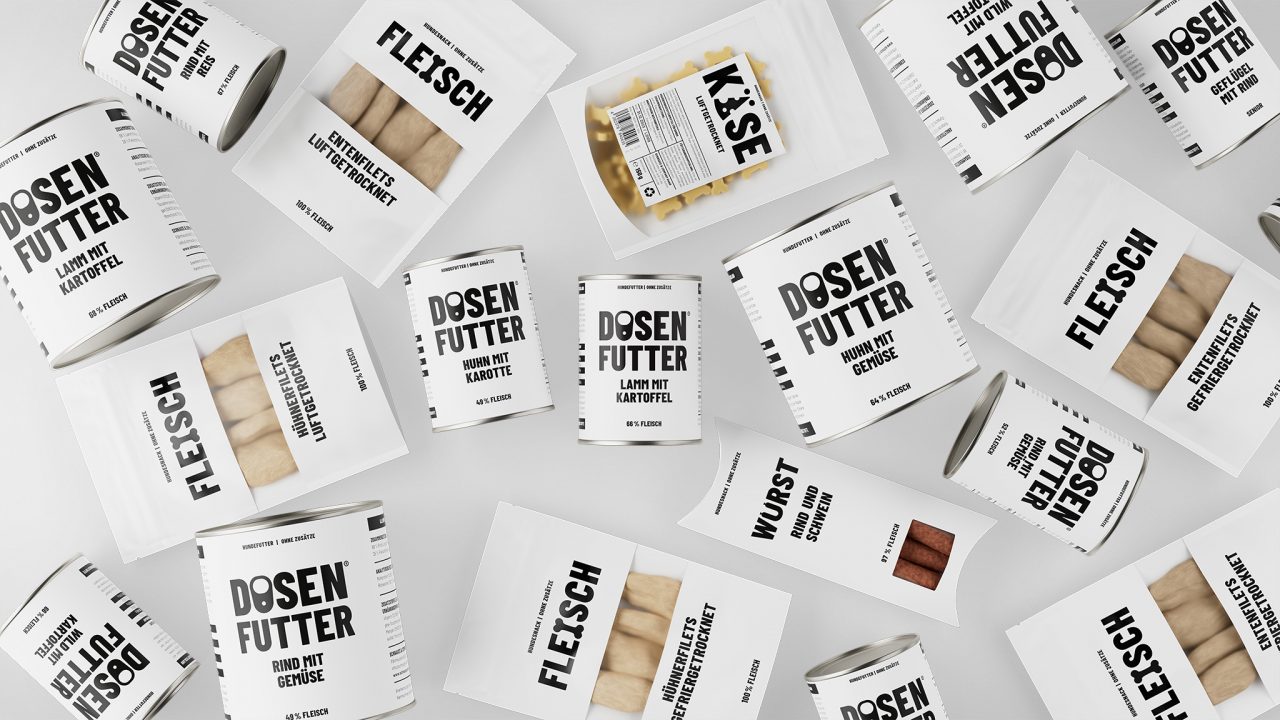
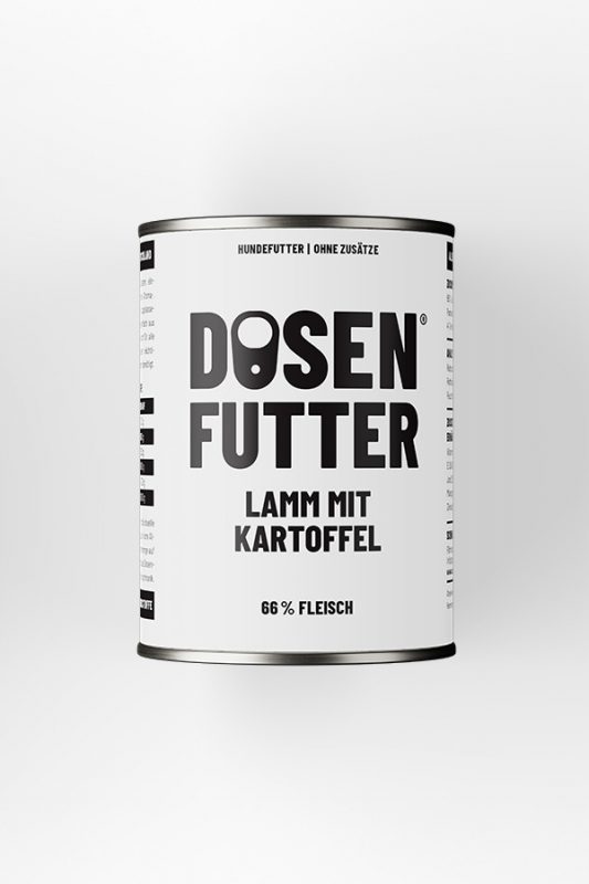
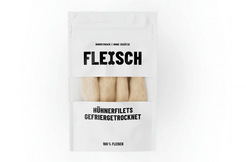
Packaging design for a new product line across four categories.
We focused only on what’s essential. Just like the product itself, the packaging reflects a radical simplicity – in name, in material, in design.
We used plain white paper, black ink and a reduced, honest typeface. The result is a packaging line that speaks the language of clarity. Nothing more. Nothing less.
Agency: TankTank
Team: Till Felber, Dalia Ghandour, Anna-Maria Muro Pita
Awards: Bronze – Art Directors Club Germany Packaging Design